CONTEXT
Making everyday banking intuitive for everyone
The Ways to Bank homepage was originally designed with a primary focus on helping existing customers complete specific tasks. However, research revealed a clear opportunity to improve digital adoption KPIs by tailoring the experience for both current users and prospective customers, who were already showing strong intent to open an account.

My Role:
Outcomes:
13%
increase in mobile app downloads within three months of launch, indicating stronger digital adoption
4.7
seconds
faster task completion time on average, thanks to a simplified help journey
Challenges:
The business challenge was twofold:
Optimize the journey for existing customers seeking support with everyday banking tasks
Create a guided, discovery-driven experience for prospects across BMO.com (Canada) and BMOHarris.com (U.S.)
This dual focus aimed to increase engagement, simplify navigation, and better align the experience with users’ goals, regardless of where they were in their banking journey.
Clarifying the Problem Space
To redesign the Ways to Bank experience effectively, I followed a research-driven, collaborative approach that combined strategic analysis with user empathy.
User Research & Discovery
Throughout the project, I worked closely with the cross-functional team, aligning our efforts across disciplines to continuously test, validate, and refine design solutions.
To uncover strategic opportunities, I conducted a competitive audit of over 24 institutions, including banks, fintech startups, and non-bank platforms. This helped identify:
Common UX and content patterns in how others present digital banking options
Gaps in SEO, content strategy, and design hierarchy where BMO could lead
Opportunities to differentiate the experience for both Canadian and U.S. audiences

To kick off the Ways to Bank redesign, we grounded our work in user research, data analysis, and cross-functional collaboration. The discovery phase focused on understanding both user behaviors and business goals, and aligning key stakeholders around a shared vision.
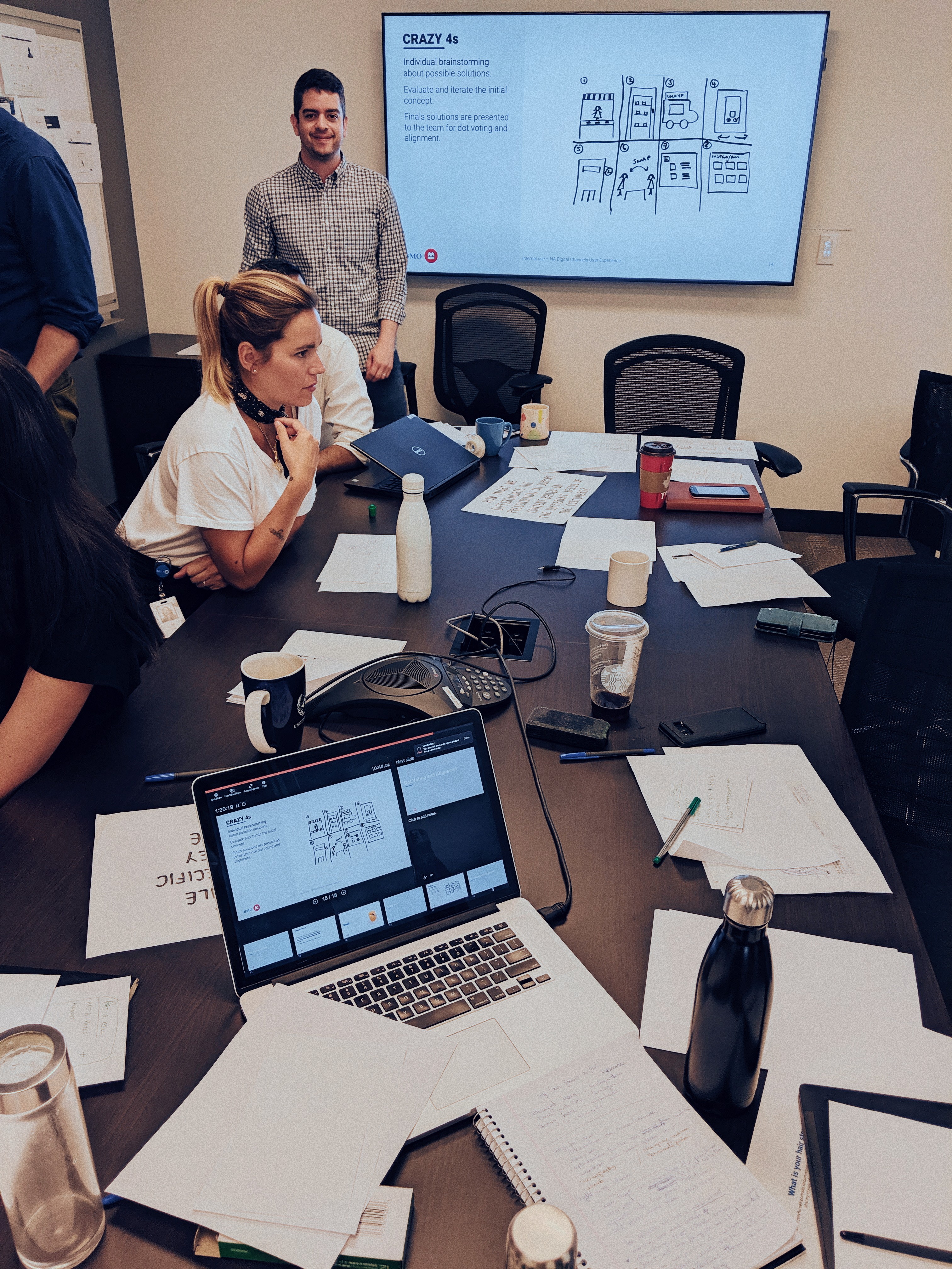
To turn insights into action, I facilitated a three-day workshop series with stakeholders from content, product, design, and development teams:
This process helped build a deep understanding of our users and created alignment across teams before entering design and prototyping.
Day 1 – Context & Insights
Lightning talks covering research findings, product analytics, and business objectives
Day 3 – Ideation & Alignment
Shared lightning demos, co-created ideas, and voted on the most promising concepts to move forward
Problem Statements
How Might We ensure that mobile users get the specific support that they need to complete a task quickly?
How Might We differentiate the presentation on support content based on the different needs of the customers?
To better understand how users expect to find information I conducted a remote, unmoderated card sorting study with 80 participants using Optimal Workshop and UserTesting.com and users naturally group the categories by channels, not tasks
Most participants organized cards under familiar categories like Online, ATM, and Mobile, indicating a strong mental model aligned with banking channels rather than specific tasks.
These insights played a key role in reshaping the information architecture, making it more intuitive and user-centered for both new and existing BMO customers.

During the discovery phase, I used data and user research to build actionable insights.
Which we then translated into:
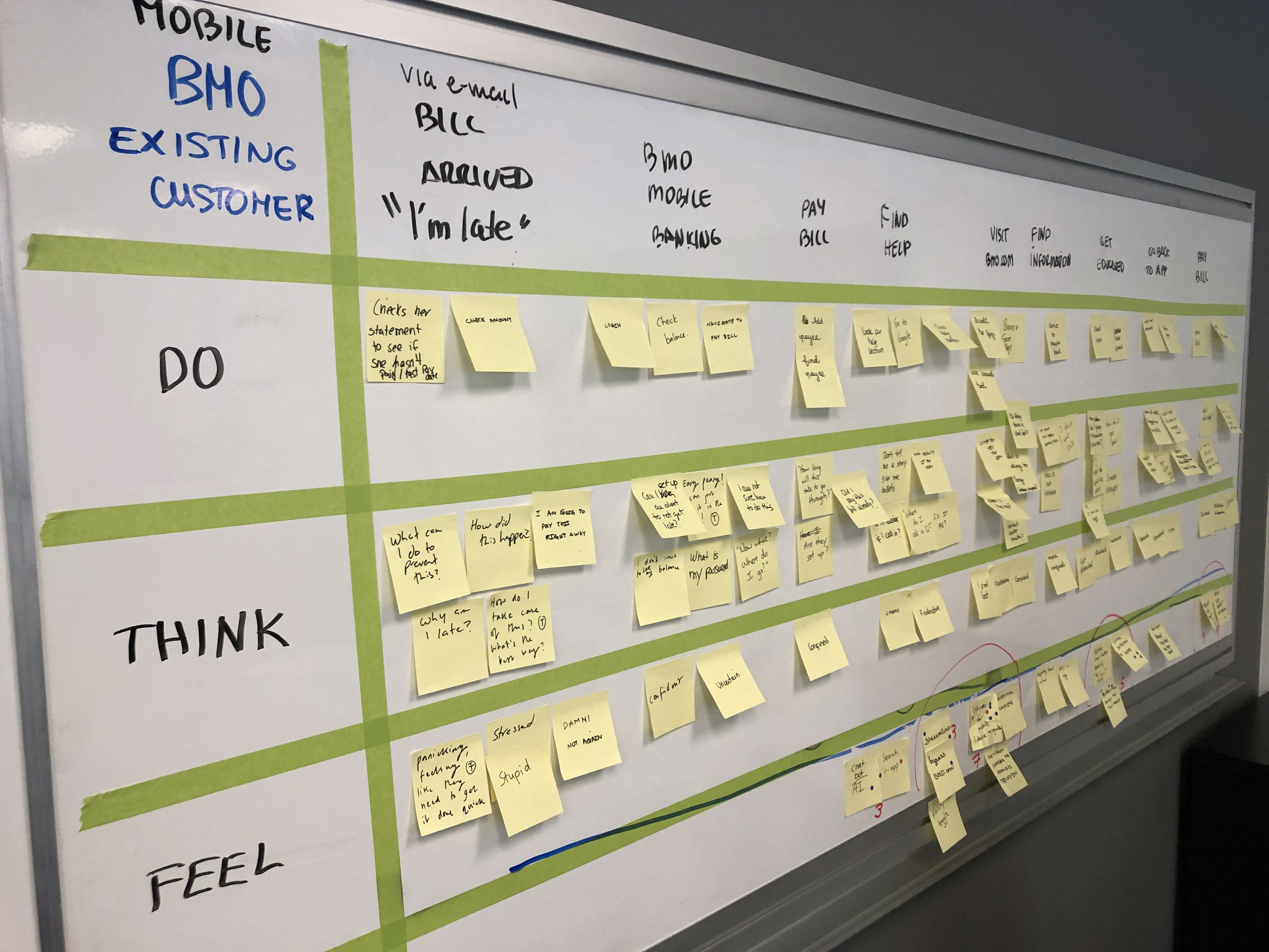
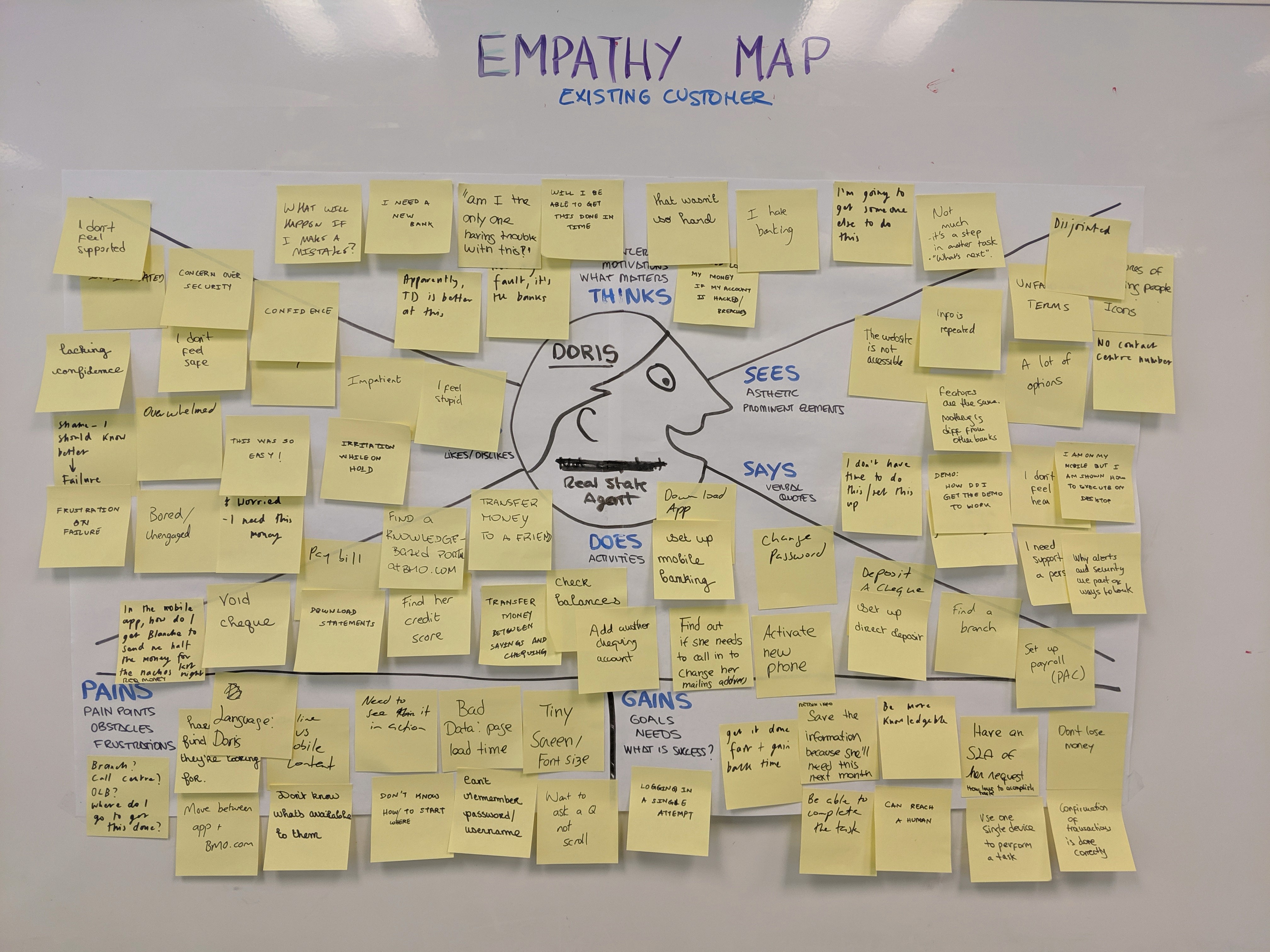
User flows to clarify task completion across devices
An As-Is scenario map to identify gaps in the current experience
A new sitemap that restructured the information architecture to better support both existing customers and prospects
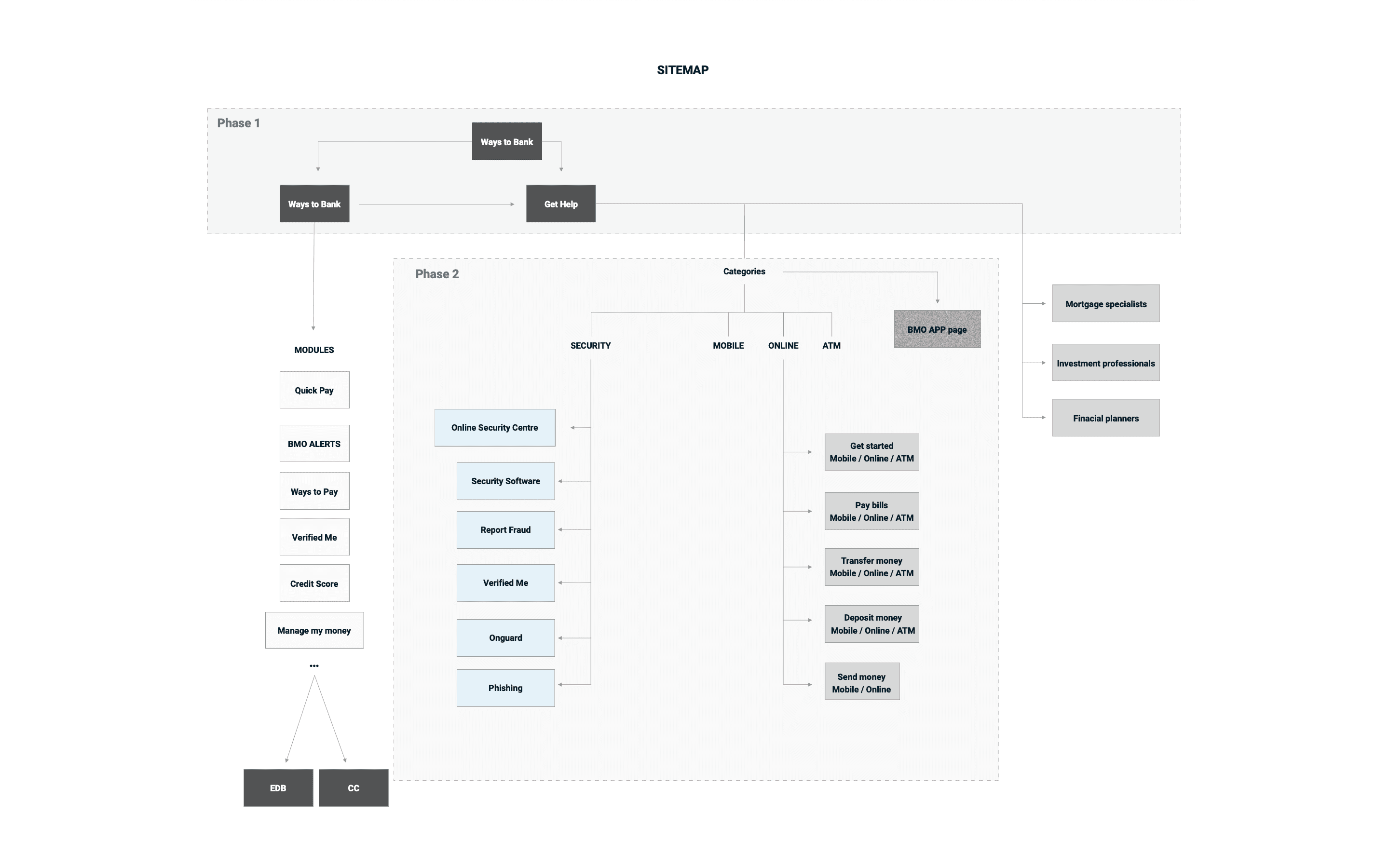
Early in the design process, I created low-fidelity wireframes to explore and align on the structure and flow of the page with stakeholders.
Each feature went through an iterative cycle of requirements gathering, stakeholder alignment, detailed specs, and developer handoff. This approach allowed us to move efficiently from concept to execution while maintaining clarity and consistency.
Once we aligned on the site map and wireframes, I moved into high-fidelity design following BMO’s brand guidelines to ensure visual consistency across the platform.
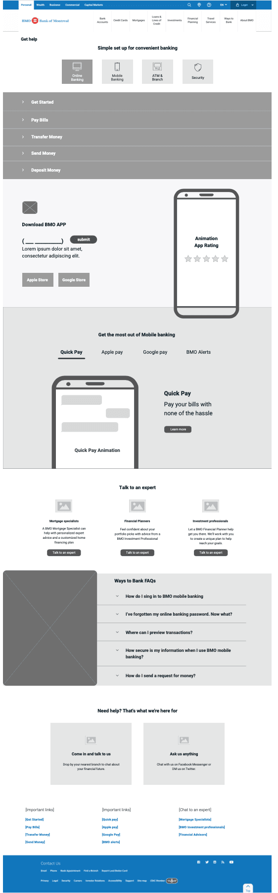
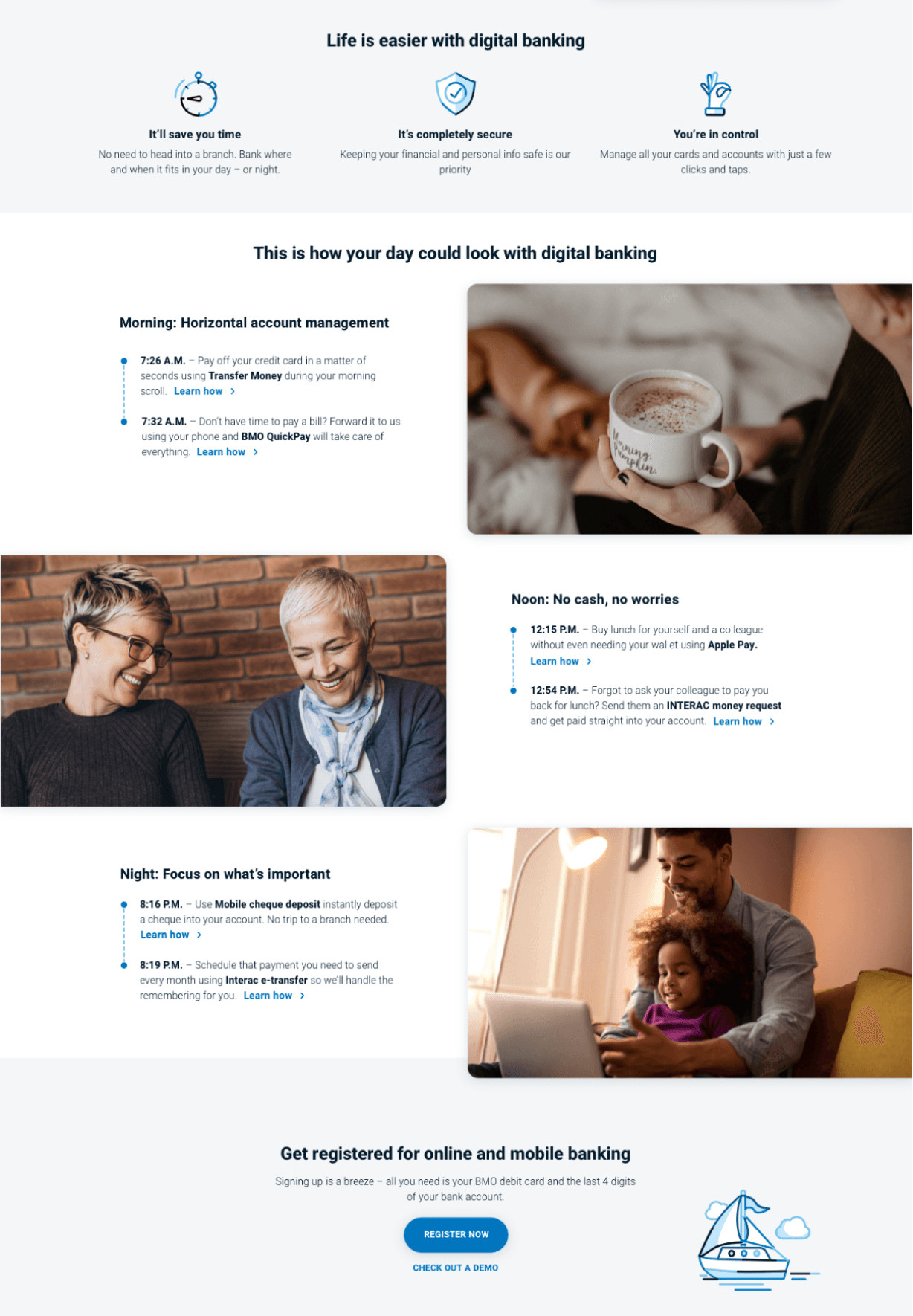
At BMO, we know that many of our customers are 50 and over—and that adapting to new technology can sometimes feel overwhelming.
That’s why we designed our digital banking experience to be simple, secure, and supportive, helping you take control of your finances with ease.

To elevate the user experience and improve feature discoverability, I incorporated subtle animations, including animated icons, throughout the interface.
These animations served multiple purposes:
Caught user attention to key features and new tools
Helped explain unfamiliar functionality in a lightweight, intuitive way

IMPACT
Introduced two key journeys, a new Help Journey for existing customers and a Discovery Journey for prospects, integrated with digital tools to drive higher digital adoption.
Reduced page redundancy and confusion, enabling us to consolidate content and focus on helpful, task-oriented guidance for mobile, desktop, and ATM use, supporting the migration of routine transactions to digital channels.
Improved SEO performance, boosting search rankings and organic traffic share by delivering relevant, streamlined content.
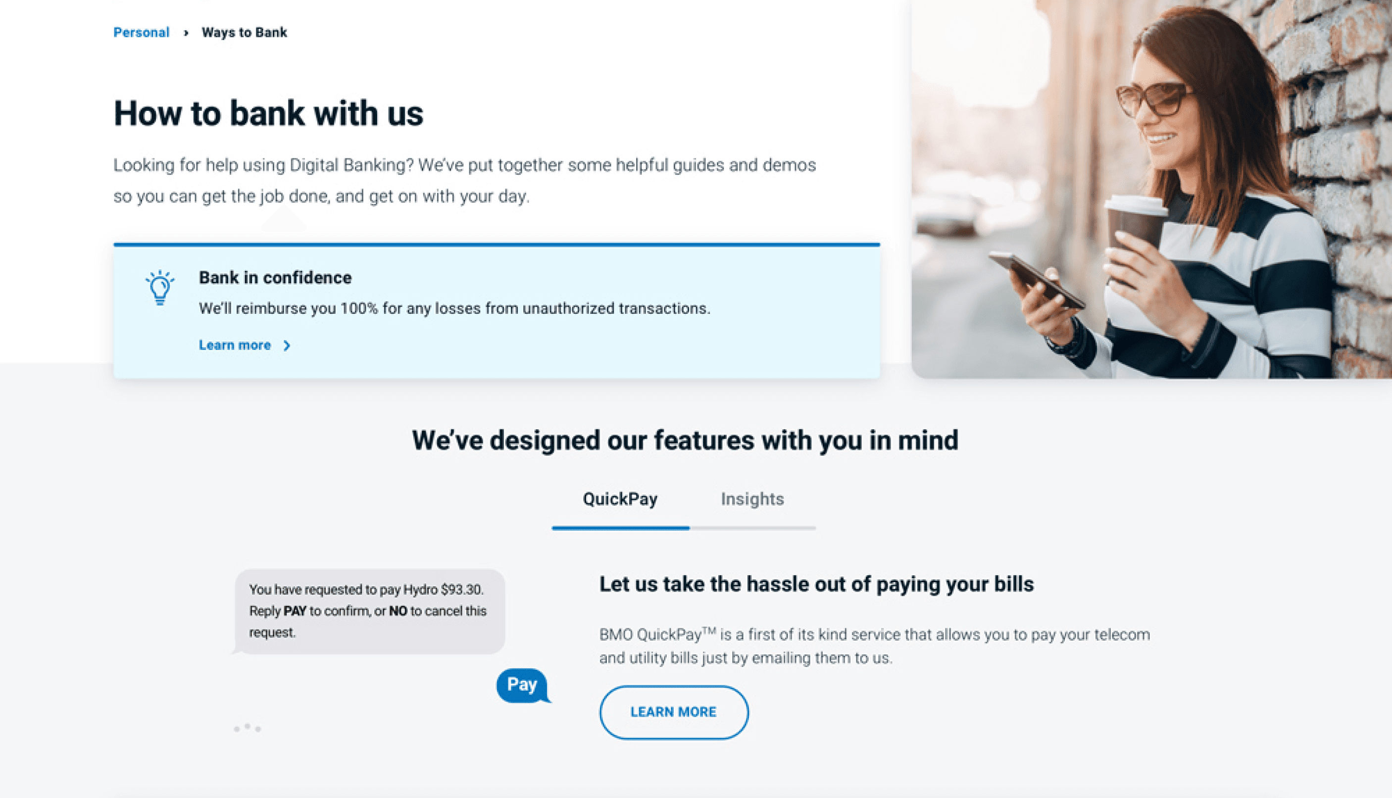
Used UI animations to highlight top features like QuickPay and CreditView, creating excitement and helping prospects visualize the digital BMO experience.
Launched 18+ redesigned pages that captured 90% of traffic to the Ways to Bank section within three months of launch.
Achieved a 40% reduction in time spent learning how to complete everyday banking tasks on BMO.com.