CONTEXT
At RBC Wealth Management, client onboarding is at the heart of operations. It's how Advisors and Associates create profiles, open accounts, and ensure KYC compliance. Yet, the onboarding process was slowing users down. Fragmented systems, manual workarounds, and unclear steps made it time-consuming and error prone, affecting both efficiency and the client experience.
We transformed a complex, time-consuming onboarding process into a clear and intuitive experience, making it easier for Advisors to set up client profiles, open investment accounts, and manage KYC information seamlessly.
The outcome: a streamlined tool that saved over 354 hours in just six months and significantly reduced errors and manual rework.
My Role:
Outcomes:
354
hours saved for Advisors and Associates (over 6 months).
74
hours saved for Branch Operations.
76%
reduction in KYC reviews required annually
70%
decrease in review and approval time for Advisors and Associates
20%
adoption growth was achieved in the first 3 months, rising from 73% to 93%.
Challenges:
Complex Regulatory Environment: Wealth management onboarding is bound by strict compliance, legacy processes, and deeply ingrained user habits.
Advocating for Design: The product and tech teams were initially delivery-driven, with minimal focus on user-centered design.
Changing User Behavior: Advisors and Associates were used to workarounds built into the old system, making adoption of the new experience a critical success factor.
Clarifying the Problem Space
To redesign the client onboarding journey, I took a collaborative, research-led approach, partnering with UX Researchers to interview 20+ users and stakeholders. We uncovered key pain points, synthesized insights into themes, and prioritized them by impact and feasibility, all while staying closely aligned with business goals through co-creation and continuous validation.
Key Insights:
The experience was confusing and inefficient, especially for new or occasional users, due to a lack of role-specific guidance.
Outdated questions and vague error messages caused delays and extra work.
Users had to repeat steps when managing related accounts, with no clear way to view or manage client relationships holistically.
Regulatory changes to the KYC process increased the administrative burden on Advisor teams, adding to the overall complexity.
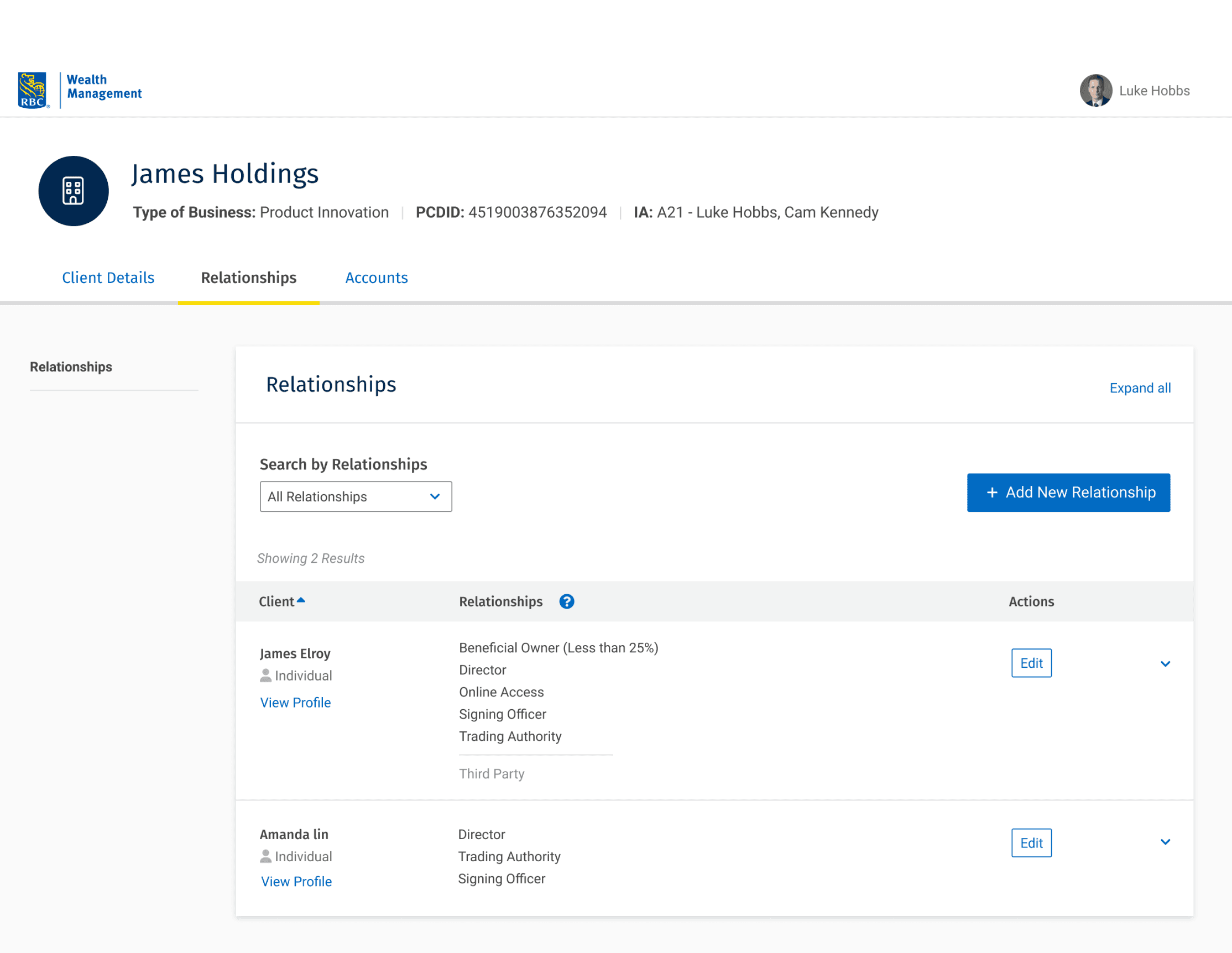
The system lacked a centralized way to manage client relationships, which became even more problematic as Private Corporation clients were introduced.
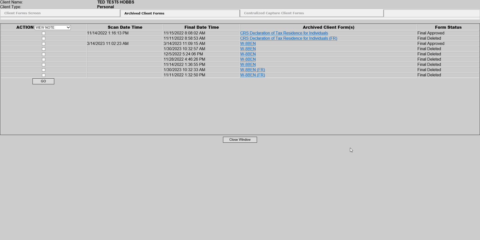
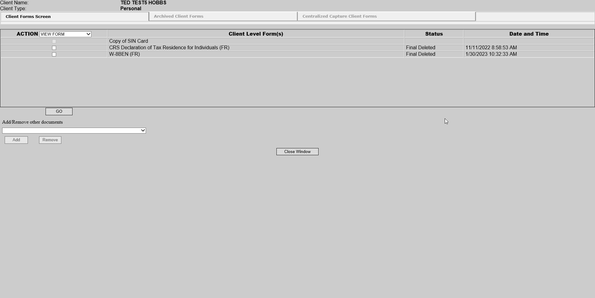
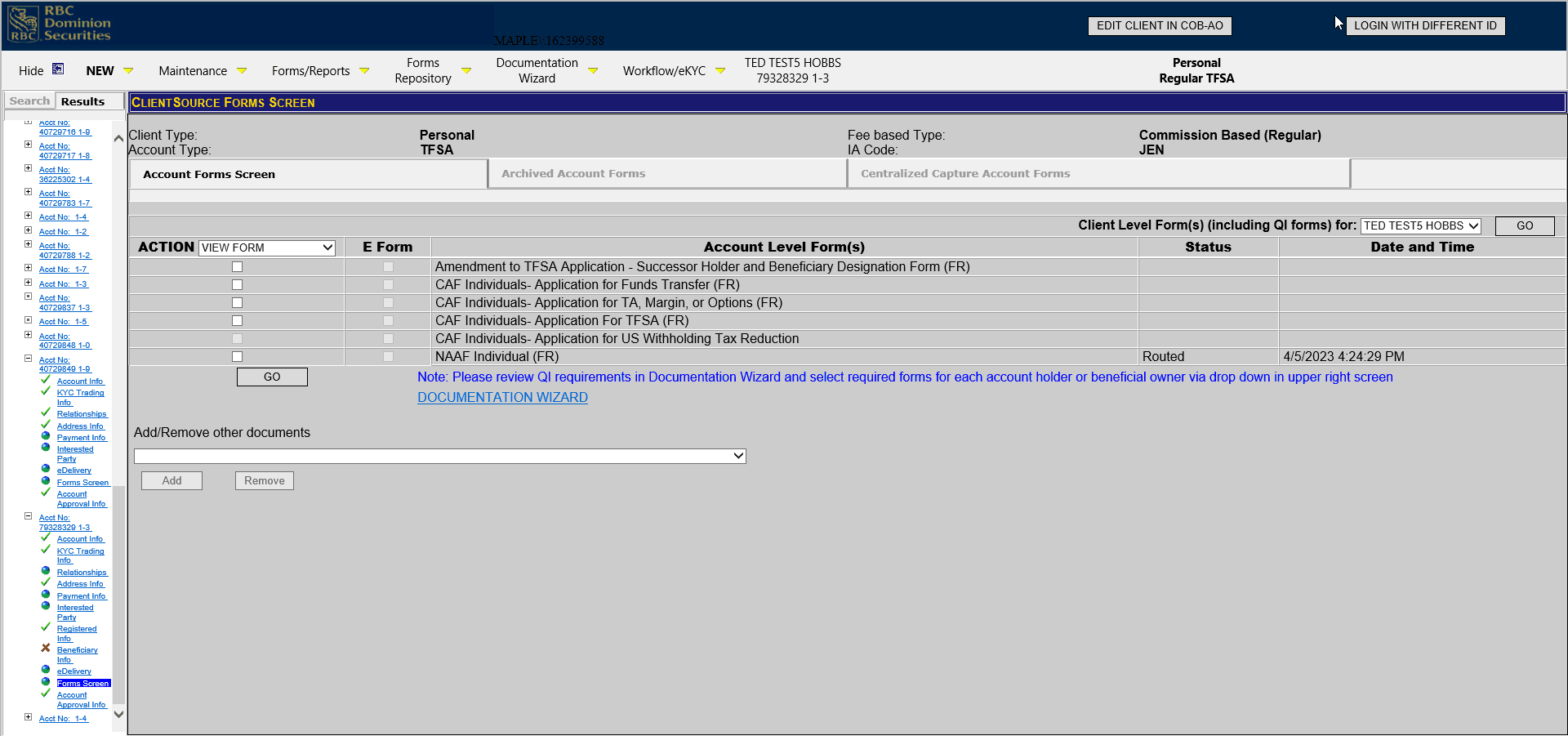
Before:
The original tool felt outdated and clunky, like an old MS-DOS banking system. It was hard to navigate, prone to manual errors, and lacked clear inputs or feedback. Users often felt confused, frustrated, and relied on workarounds to get things done.
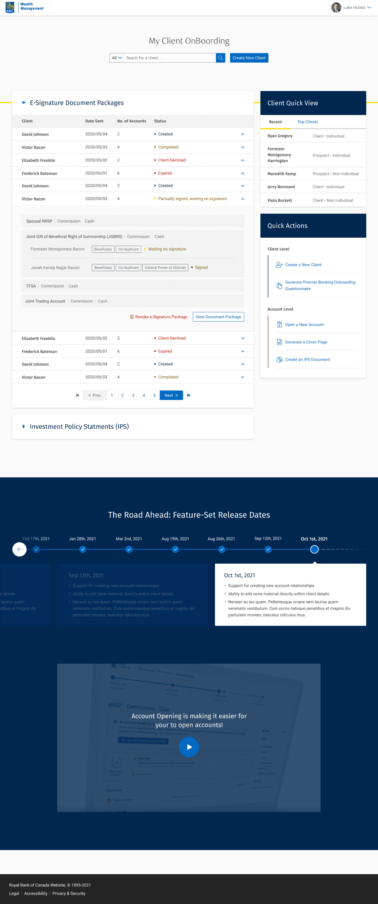
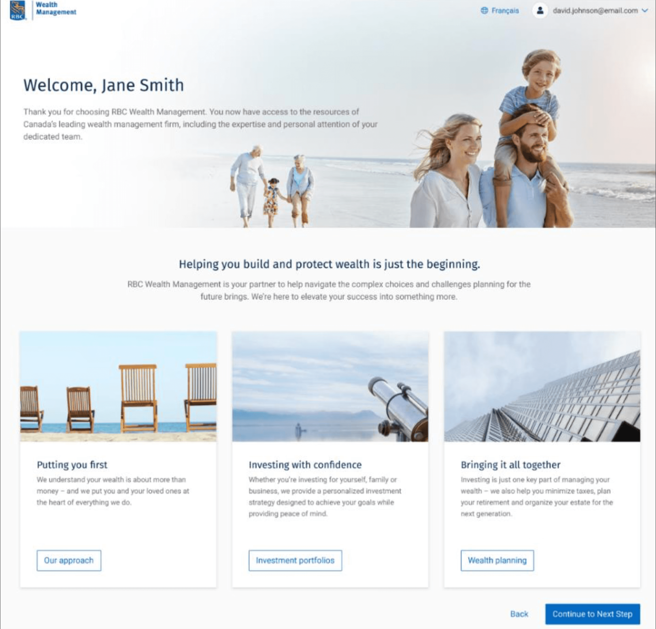
The new experience is clear, and guided, helping users find the right information quickly and confidently, with less effort.
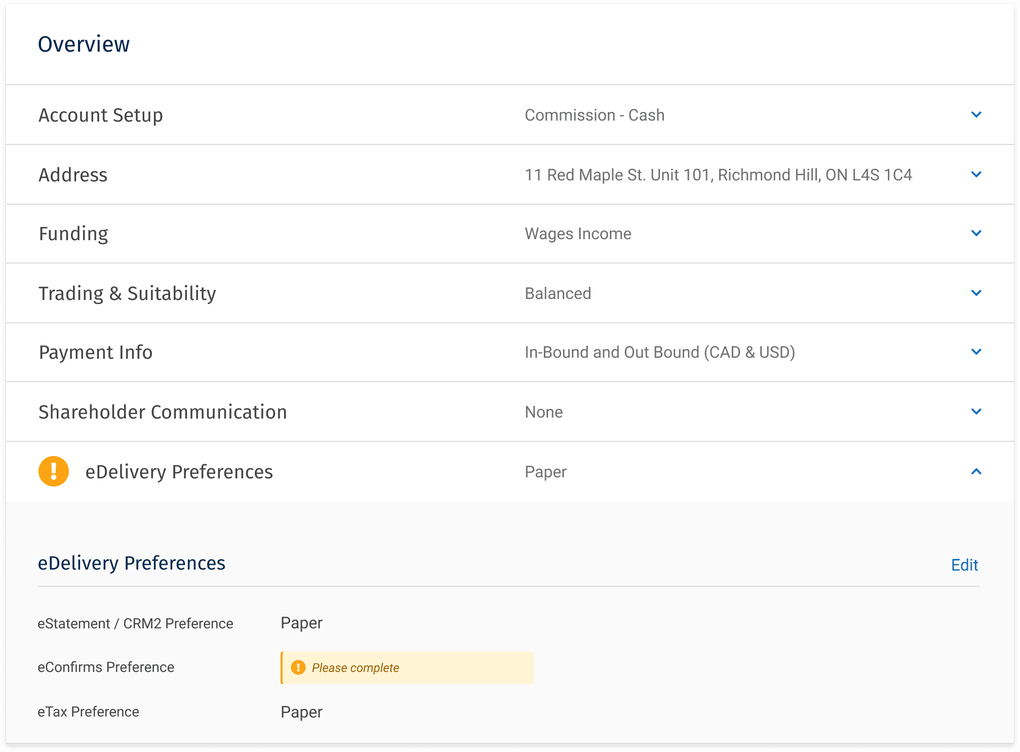
Account view:


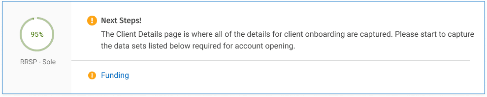
Dynamic field validation helped catch missing or incorrect information early.
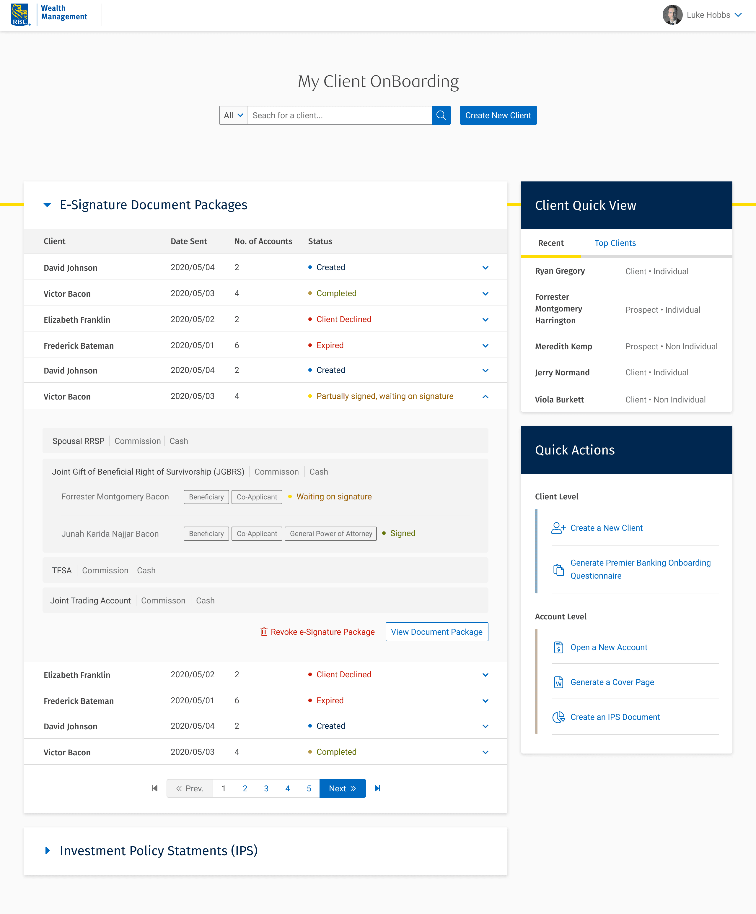
The homepage was designed as a central hub to help users navigate their work with confidence. To build trust and support adoption, We added a consistent spot for real-time updates, so users always know what’s new and never feel caught off guard.
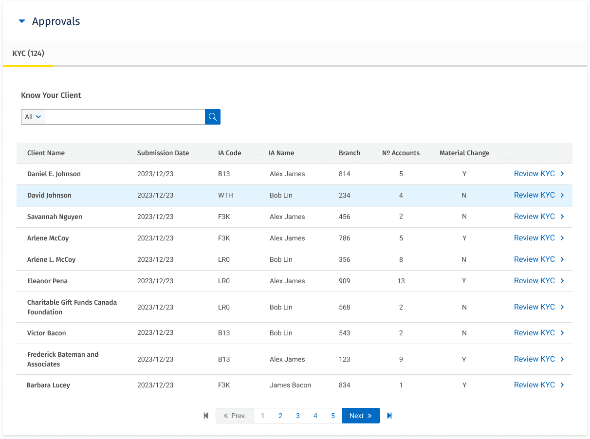
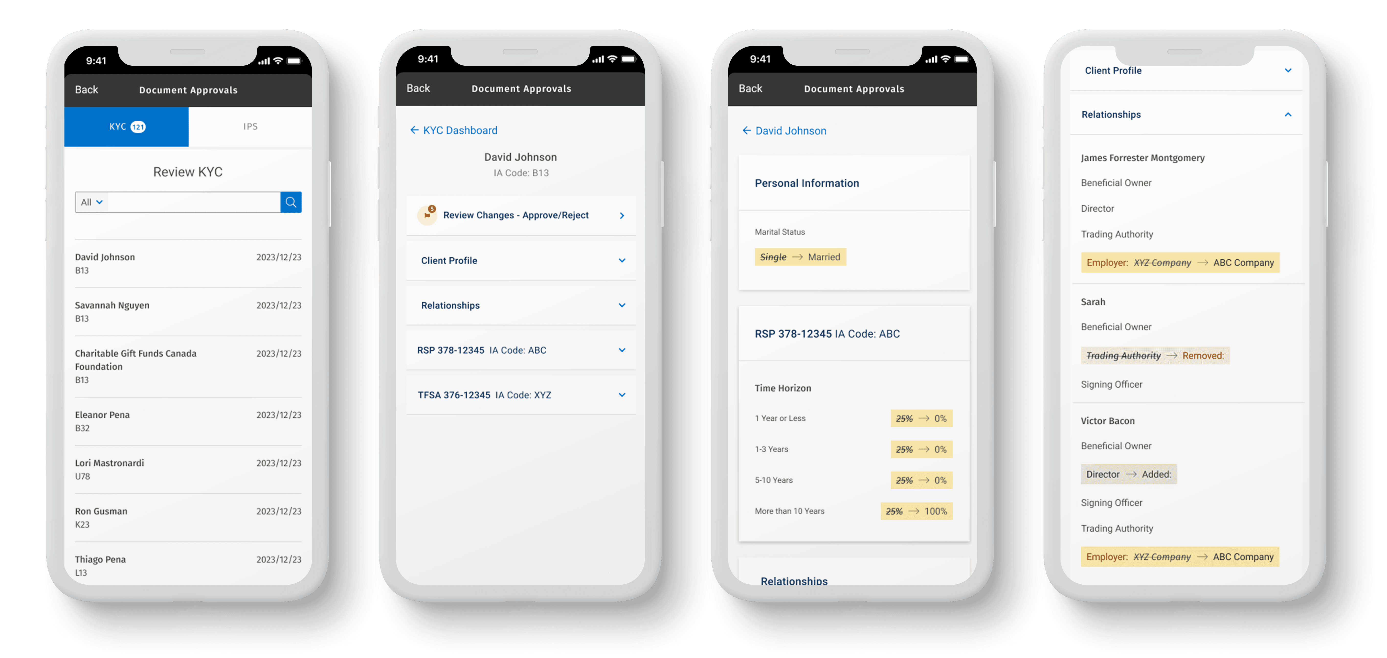
We simplified the KYC submission by moving it to the client profile level, so instead of submitting it for each account, users can now do it once, faster and more efficiently, right from the profile.

Users now have an intuitive way to review and approve KYC data through a streamlined dashboard that makes managing pending approvals fast and easy. They can also search for a client and make any necessary updates based on their role, all in one place.
CONSISTENCY ACROSS PLATFORMS
The KYC approval often includes multiple devices. We designed an experience that worked on desktop and was integrated with the global mobile app used by advisors. Users could start approving on a laptop at work and finish booking on a smartphone on the go. The app also remembered users’ about expiry dates, pending approvals, and material change information. A personalized approach meant a better, faster experience.
The COB app lacked a centralized way to manage client relationships, causing confusion and inefficiencies, especially with the addition of Private Corporation clients.
Setting up relationships became complex and inconsistent.
We started by mapping core relationship flows and aligning early with stakeholders, which clarified expectations and laid a solid foundation for design and research.
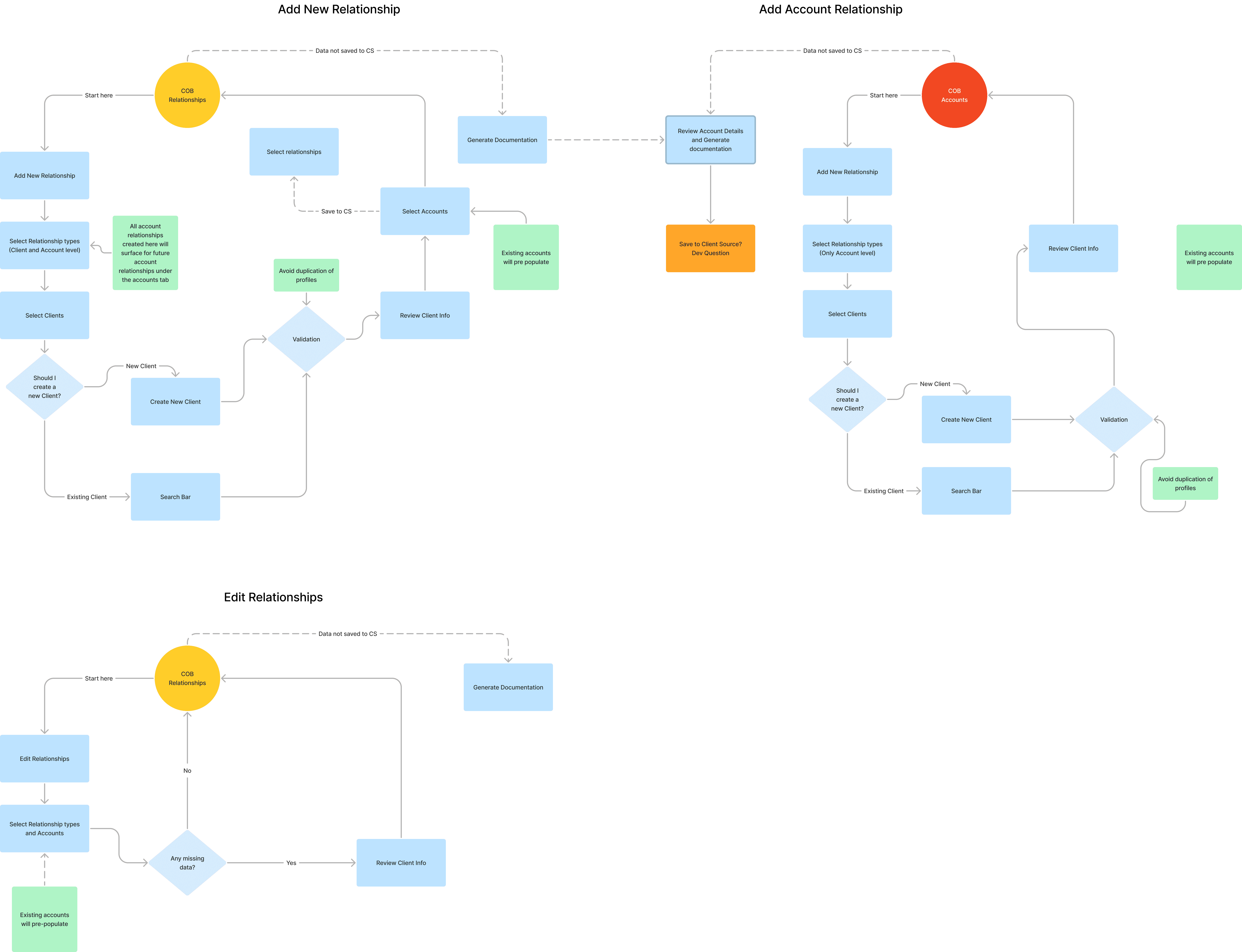
All relationship tasks are now centralized, eliminating repetitive steps for clients and accounts.
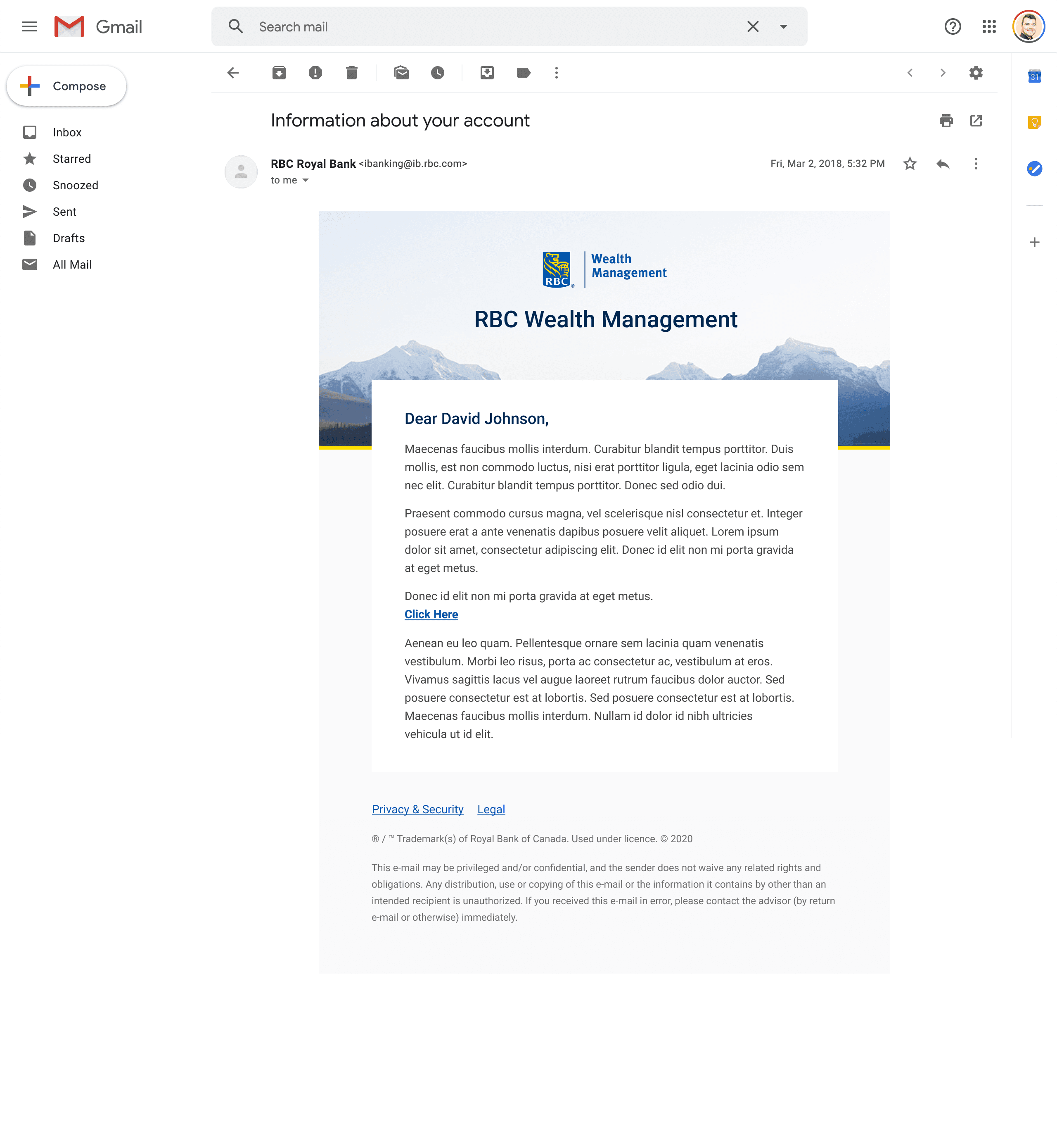
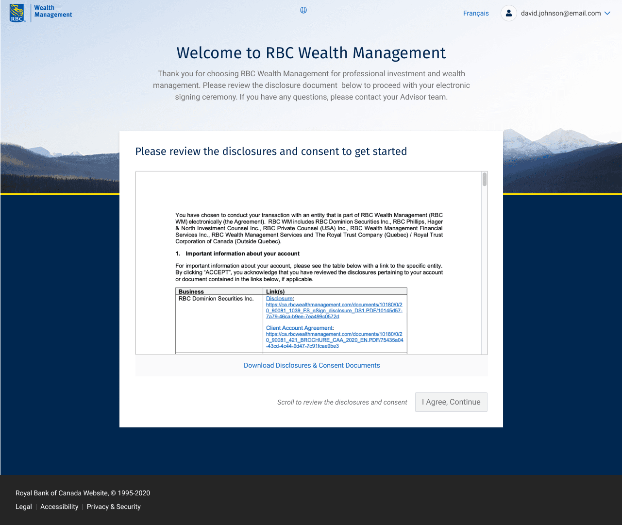
We redesigned the e-sign flow so advisors can send all documents, account details, and changes directly from the app, no need for external tools.
Clients access their documents through two-factor authentication and can easily review and sign them.
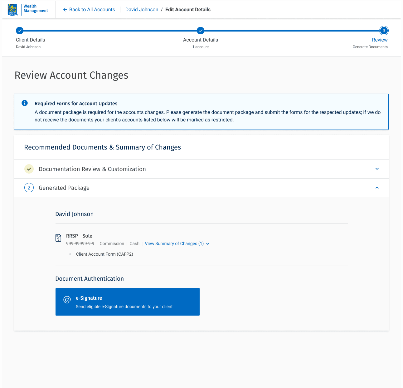
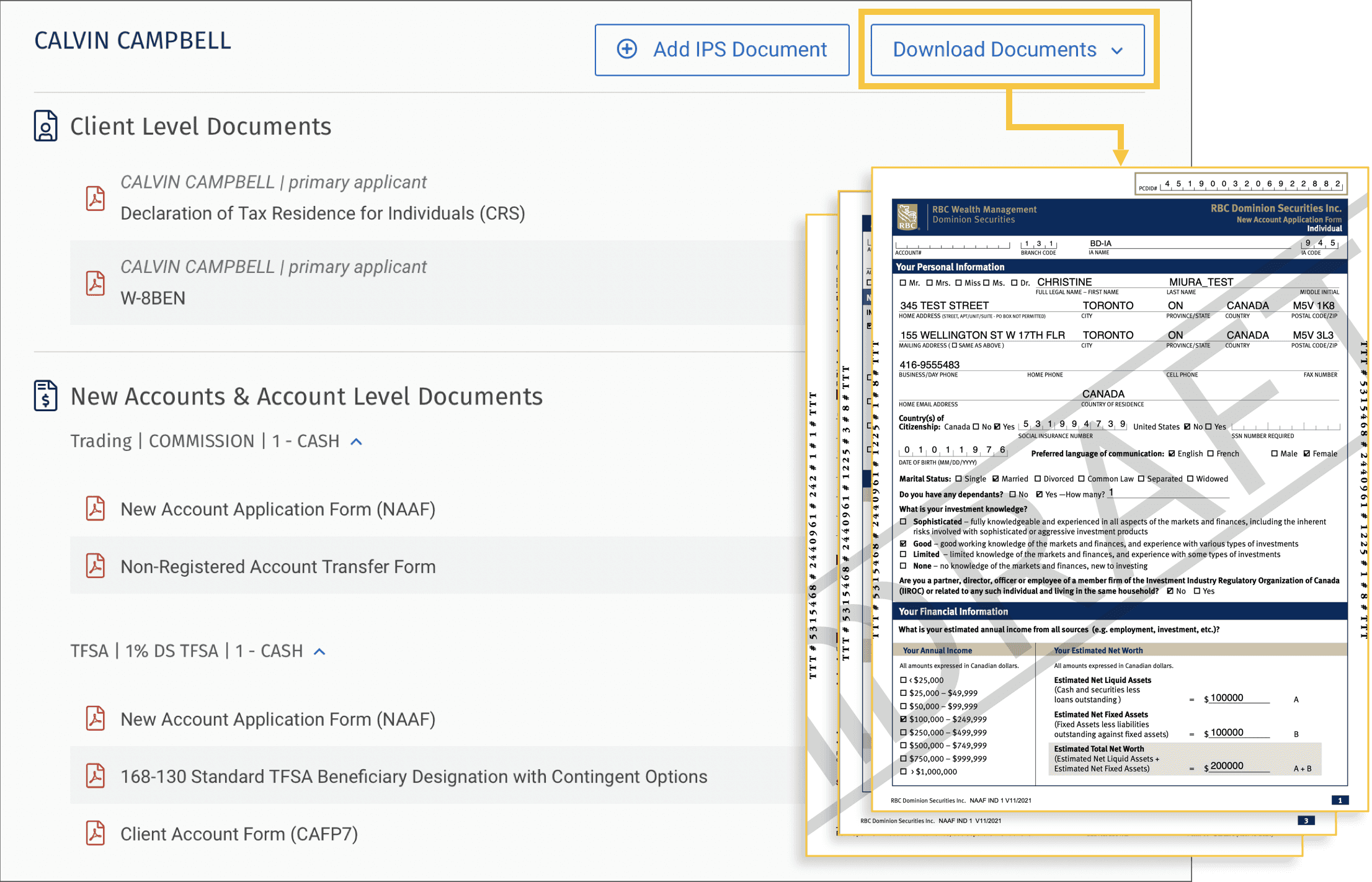
A one-click download organizes everything by account type, making the process simple and efficient.
IMPACT
The new COB platform has redefined how RBC Wealth Management onboards clients, boosting operational efficiency, reinforcing compliance, and strengthening client trust.
The result: a streamlined, guided experience that reduces friction, minimizes errors, and builds user confidence at every step.
Initial adoption reached 73%, and after implementing key enhancements and new journey flows, adoption rose to 93%.
Increased Advisor and Associate satisfaction in 24% with onboarding experience.
Reduced KYC reviews from 500,000 to ~120,000, significantly lowering operational overhead.
Sharp decrease in documentation errors and manual rework.
Most importantly, the project helped foster a culture shift within the organization, embedding a more design-led approach to solving business challenges.